# Items
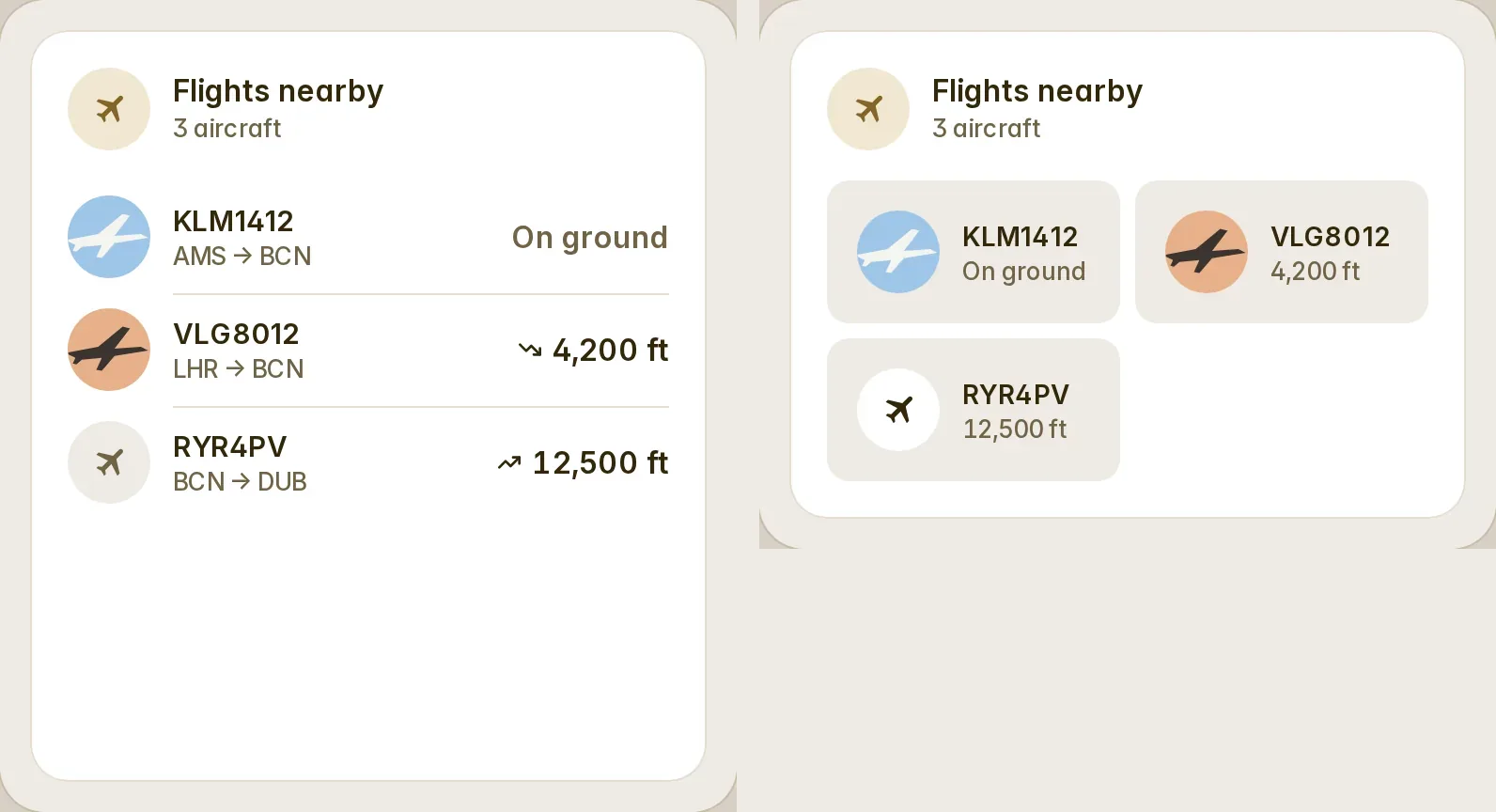
The items of a sensor’s list attribute, a row each — flights overhead, departures, deliveries — with a flights preset for FlightRadar24.
`custom:fluvy-items-card` · [Try it live](https://acosta290.github.io/fluvy/?card=items) · [All cards](../cards.md#everyday)
## Example
```yaml
type: custom:fluvy-items-card
entity: sensor.it_flights
```
The picture above, on the demo house: put your own entities in place of its.
## Layouts
`variant` chooses the layout. The picture above is `rows`, the default; each of the others is the example plus the line over it, and opens in the live demo.
variant: compact
variant: tiles
## All options
```yaml
type: custom:fluvy-items-card
entity: sensor.it_flights
# title:
# subtitle:
# icon:
show_icon: auto
name_lines: 1
attribute: auto
preset: auto
# item_name:
# item_secondary:
# item_value:
# item_unit:
# item_icon:
# item_image:
# item_url:
# items_template:
# sort:
sort_order: ascending
variant: rows
max_rows: 5
show_count: true
show_image: true
item_tap: sheet
# tone:
# color:
# card_color:
# card_opacity: 100
# card_border: true
# unavailable: dashed
# empty_text:
hide_empty: false
# tap_action:
# action: more-info
# hold_action:
# action: more-info
# double_tap_action:
# action: none
# icon_tap_action:
# action: none
# icon_hold_action:
# action: none
# icon_double_tap_action:
# action: none
```
## Options
| Option | Default | What it does |
| --- | --- | --- |
| `entity` | **required** | The sensor whose attribute holds the list of items. A `sensor`. |
| `title` | | The title at the top of the card. |
| `subtitle` | | The line under the title. |
| `icon` | | The card’s icon, in place of the entity’s own. |
| `attribute` | `auto` | The attribute of the sensor that holds the list of items. `auto`, or your own. |
| `preset` | `auto` | Reads the items as a known kind of list (flights), or by the fields below. `auto` · `none` · `flights`. |
| `item_name` | | Where each item’s name comes from. |
| `item_secondary` | | Where the line under each item’s name comes from. |
| `item_value` | | Where each item’s value comes from. |
| `item_unit` | | Where each item’s unit comes from. |
| `item_icon` | | Where each item’s icon comes from. |
| `item_image` | | Where each item’s picture comes from. |
| `item_url` | | Where each item’s link comes from. |
| `items_template` | | Makes the list from a template, so that any sensor can be a list of items. |
| `sort` | | Sorts the items by one of their fields. |
| `sort_order` | `ascending` | Sorts the items up or down. `ascending` · `descending`. |
| `variant` | `rows` | The card’s layout. `rows` · `compact` · `tiles`. |
| `max_rows` | `5` | How many rows the card has room for. 1 to 20. |
| `show_count` | `true` | Says on the head’s line how many items there are. |
| `show_image` | `true` | Shows each item’s picture in its circle. |
| `item_tap` | `sheet` | What a tap on an item does: open its sheet, or nothing. `sheet` (Opens its details) · `none`. |
| `empty_text` | | What the card says while it has nothing to show. |
| `hide_empty` | `false` | Hides the whole card while it has nothing to show. |
Its look and its actions, as on every card
| Option | Default | What it does |
| --- | --- | --- |
| `show_icon` | `auto` | Shows the icon, hides it, or lets the card decide. `auto` · `always` · `never`. |
| `name_lines` | `1` | Lets the name in the card’s head take two balanced lines where one would cut it; the head is a line taller whatever the name. `1` · `2`. |
| `tone` | the card’s own | The card’s colour from the palette’s tones; left out, the tone of what it shows. `accent` · `light` · `heat` · `cool` · `dry` · `fan` · `water` · `solar` · `grid` · `media` · `presence` · `armed` · `battery` · `house` · `gas` · `vehicle` (Car) · `neutral` · `ok` (Good) · `warning` · `danger`. |
| `color` | | The card’s colour: its circle, its accents and its tints wear it. Left out, the colour of what it shows. |
| `card_color` | | Paints the card’s surface in a colour of your own. |
| `card_opacity` | `100` | How solid the card’s surface is, in percent: under 100 the view’s background shows through. Left out, the house’s. 0 % to 100 %, in steps of 5. |
| `card_border` | `true` | Whether the card draws its hairline border. Left out, the house’s. |
| `unavailable` | `dashed` | How the card looks while its entity is unavailable: dashed, or quiet as when it is off. Left out, the house’s. `dashed` · `quiet` (As when off). |
| **Interactions** | | |
| `tap_action` | `more-info` | What a tap on the card does. |
| `hold_action` | `more-info` | What a long press on the card does. |
| `double_tap_action` | `none` | What two taps on the card do. |
| `icon_tap_action` | `none` | What a tap on the icon does. |
| `icon_hold_action` | `none` | What a long press on the icon does. |
| `icon_double_tap_action` | `none` | What two taps on the icon do. |
More about them in [Options every card takes](../customising.md#options-every-card-takes).
## Guide
The card lists the items of a sensor's list attribute (aircraft overhead, departures, parcels), a row each, under a
head that counts them. `attribute: auto` takes the first attribute that holds a list (`flights`, `items`, `entries` or
`list` first); `items_template` gives the list as JSON instead, so any sensor works.
```yaml
# FlightRadar24: the flights preset draws itself
type: custom:fluvy-items-card
entity: sensor.flightradar24_current_in_area
title: Flights nearby
max_rows: 5
empty_text: Clear skies
```
`preset: auto` draws flights where the attribute is `flights` or the items carry a `callsign` or `flight_number`: the
callsign over the route (`AMS → BCN`), the altitude with a climbing or descending arrow, the aircraft's photo, the
nearest first. A tap opens the flight's sheet, with a link to flightradar24.com.
### A list of your own
`preset: none` and map each field: `item_name`, `item_secondary`, `item_value`, `item_unit`, `item_icon`,
`item_image`, `item_url`.
```yaml
type: custom:fluvy-items-card
entity: sensor.metro_departures
attribute: departures
preset: none
item_name: "{line} → {destination}" # words with {field}; {a|b} takes b where a is empty
item_secondary: Platform {platform}
item_value: due # a field alone: due, airport.city, legs.0.from
item_unit: min
sort: due
variant: compact
```
- A number is written in your locale, a date as a moment. A ` · ` part that says nothing is dropped.
- `sort` orders by a field (`sort_order: descending` to turn it); items without the field go last.
- `max_rows` (1 to 20) is the card's height, not the list's length: fewer items keep the size.
- `item_tap: none` makes the rows still; the head's tap opens the sensor's details.
Older names the card still reads
| Older name | Read as |
| --- | --- |
| `sub` | `subtitle` |
| `meta` | `subtitle` |
| `layout` | `variant` |
| `view` | `variant` |
| `accent` | `color` |


