# Swipe
Any cards, one a page, turned by a swipe or the page marks under them: side by side on a wide screen, round from the last to the first.
`custom:fluvy-swipe-card` · [Try it live](https://acosta290.github.io/fluvy/?card=swipe) · [All cards](../cards.md#structure-and-navigation)
## Example
```yaml
type: custom:fluvy-swipe-card
cards:
- type: custom:fluvy-room-card
area: rm_living
path: /fluvy-auto/room-rm_living
- type: custom:fluvy-room-card
area: rm_kitchen
- type: custom:fluvy-room-card
area: rm_bedroom
```
The picture above, on the demo house: put your own entities in place of its.
## Layouts
`style` chooses the layout. The picture above is `card`, the default; each of the others is the example plus the line over it, and opens in the live demo.
style: plain
## All options
```yaml
type: custom:fluvy-swipe-card
style: card
columns: 1
gap: 40
start: 1
show_indicators: true
loop: false
remember: session
autoplay: 0
# color:
# card_color:
# card_opacity: 100
# card_border: true
cards:
- type: custom:fluvy-room-card
area: rm_living
path: /fluvy-auto/room-rm_living
- type: custom:fluvy-room-card
area: rm_kitchen
- type: custom:fluvy-room-card
area: rm_bedroom
```
## Options
| Option | Default | What it does |
| --- | --- | --- |
| `style` | `card` | Draws the card on its own surface, or plain on the page. `card` (One card) · `plain`. |
| `columns` | `1` | How many of its cards stand side by side, as many as the width holds. `1` · `2` · `3` · `4`. |
| `gap` | `40` | The room between the cards it holds, in pixels. 0 to 40, in steps of 4. |
| `start` | `1` | The page the card opens on, counted from 1. 1 or more. |
| `show_indicators` | `true` | Shows the page marks under the cards, each a button to its page. |
| `loop` | `false` | Goes round from the last page to the first, and back. |
| `remember` | `session` | Where the page it was left on is kept: this tab while it is open, or nowhere. `session` (While the tab is open) · `off`. |
| `autoplay` | `0` | Turns to the next page by itself every this many seconds; 0, only a person turns it. 0 to 3600. |
| `cards` | | The cards it holds, one a page: any card, Fluvy’s or not. |
Its look and its actions, as on every card
| Option | Default | What it does |
| --- | --- | --- |
| `color` | | The card’s colour: its circle, its accents and its tints wear it. Left out, the colour of what it shows. |
| `card_color` | | Paints the card’s surface in a colour of your own. |
| `card_opacity` | `100` | How solid the card’s surface is, in percent: under 100 the view’s background shows through. Left out, the house’s. 0 % to 100 %, in steps of 5. |
| `card_border` | `true` | Whether the card draws its hairline border. Left out, the house’s. |
More about them in [Options every card takes](../customising.md#options-every-card-takes).
## Guide
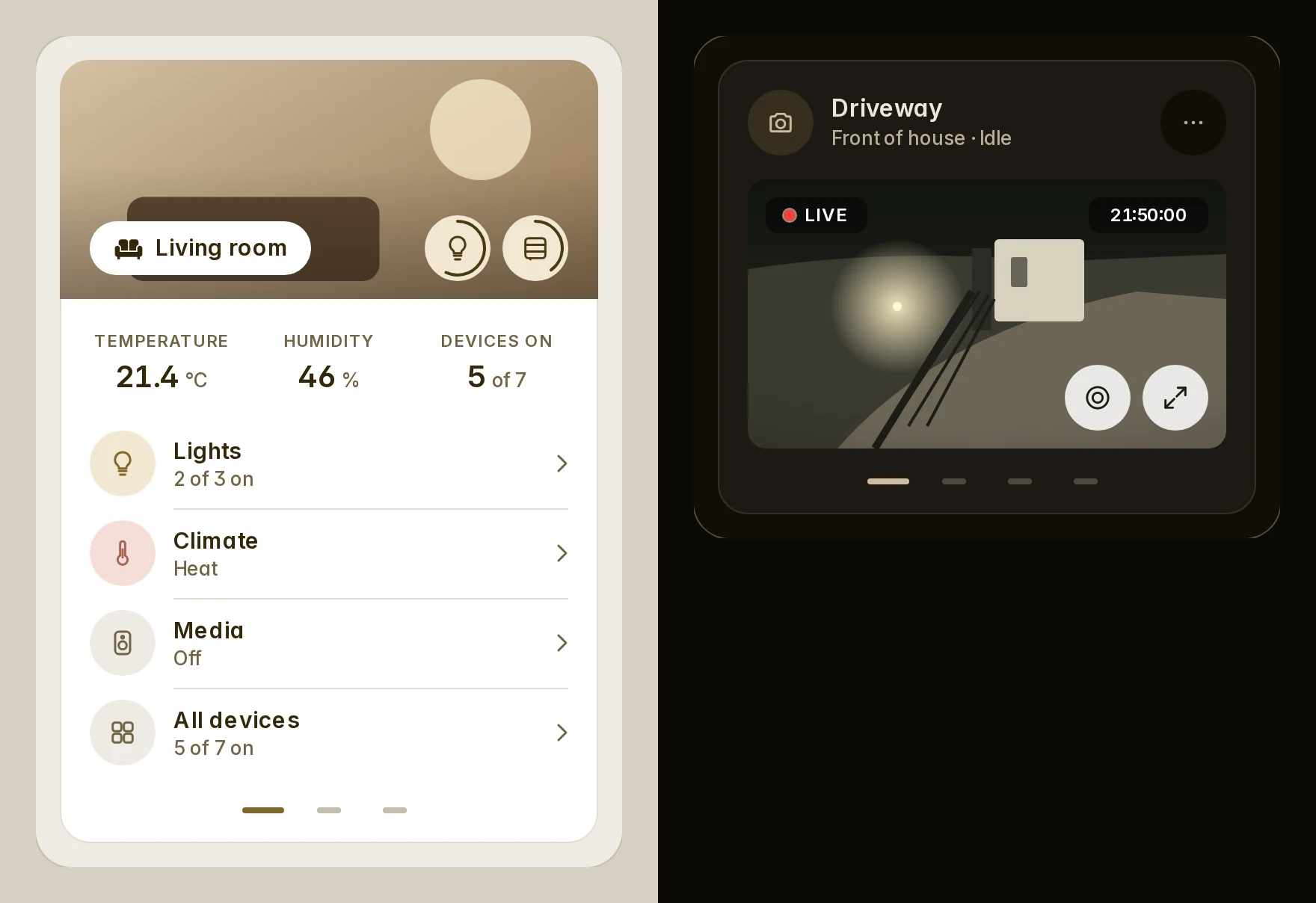
The Swipe card holds any cards, one a page, turned by a finger, a trackpad, the keys or the page marks under them.
Only the page in view and its neighbours are built, so ten cameras cost what three do.
```yaml
# a wall's cameras, turning by themselves
type: custom:fluvy-swipe-card
loop: true # on from the last page is the first
autoplay: 8 # seconds a page; 3 at least
cards:
- type: custom:fluvy-camera-card
entity: camera.driveway
- type: custom:fluvy-camera-card
entity: camera.garden
- type: custom:fluvy-camera-card
entity: camera.garage
```
```yaml
# the rooms on their own surfaces, opening on the kitchen every time
type: custom:fluvy-swipe-card
style: plain
start: 2 # counted from 1
remember: off # session (the default) reopens on the page you left
show_indicators: false
cards:
- type: custom:fluvy-room-card
area: living_room
- type: custom:fluvy-room-card
area: kitchen
- type: custom:fluvy-room-card
area: bedroom
```
```yaml
# three side by side on a desktop, one more each turn
type: custom:fluvy-swipe-card
columns: 3
gap: 24
color: teal # the page mark in force, and the Fluvy cards inside that name no colour
cards:
- type: custom:fluvy-grid-card
- type: custom:fluvy-batteries-card
- type: custom:fluvy-production-card
- type: custom:fluvy-energy-flow-card
```
- `style: card` (the default) holds the cards on one surface; `plain` leaves each its own.
- `columns` shows up to four side by side, as many as the width holds (148 px each at least).
- A drag that starts on a ruler, a dial, a map or a sideways row is theirs, as is one on anything marked
`data-swipe="off"`.
- Autoplay waits while a finger or the pointer is on it, and never runs with reduced motion.
- The card is as tall as its tallest page, so turning never moves what is under it.
Older names the card still reads
| Older name | Read as |
| --- | --- |
| `slides_per_view` | `columns` |
| `accent` | `color` |

