DialKit
Live controls for tuning interfaces. Adjust values, compare versions, and edit animation timing in your running app.
Works with React, Solid, Svelte, Vue, and plain JavaScript. The vanilla adapter has no runtime dependencies.
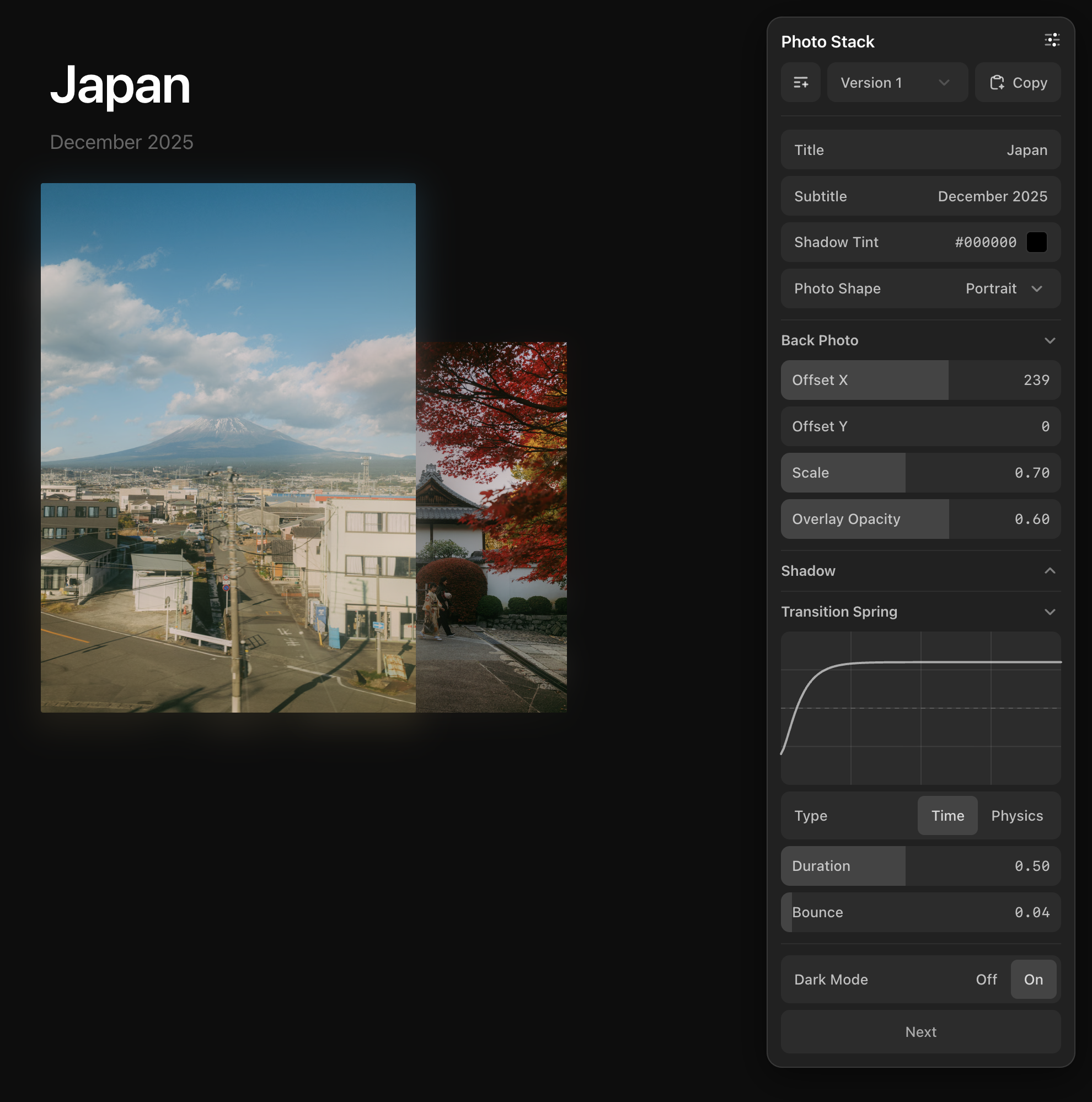
Quick start · Controls · Panel API · Timeline · Reference
Quick start
Install the adapter's dependencies in your existing app:
| Adapter | Install | Import from |
|---|---|---|
| React | npm install dialkit motion | dialkit |
| Solid | npm install dialkit motion | dialkit/solid |
| Svelte | npm install dialkit | dialkit/svelte |
| Vue | npm install dialkit motion motion-v | dialkit/vue |
| Plain JavaScript | npm install dialkit | dialkit/vanilla |
Framework support: React 18+, Solid 1.6+, Svelte 5.8+, and Vue 3.3+. Mount one root to display all registered panels.
React
import { DialRoot, useDialKit } from "dialkit";
import "dialkit/styles.css";

export default function App() {
  const values = useDialKit("Card", {
    radius: [24, 0, 64],
    color: "#a78bfa",
  });

  return (
    <>
      <div style={{ borderRadius: values.radius, background: values.color }}>
        Card
      </div>
      <DialRoot />
    </>
  );
}
In Next.js App Router, use DialKit in a client component.
Solid
import { createDialKit, DialRoot } from "dialkit/solid";
import "dialkit/styles.css";

export default function App() {
  const values = createDialKit("Card", { radius: [24, 0, 64] });

  return (
    <>
      <div style={{ "border-radius": `${values().radius}px` }}>Card</div>
      <DialRoot />
    </>
  );
}
Read values through the returned accessor: values().radius.
Svelte
<script>
  import { createDialKit, DialRoot } from "dialkit/svelte";

  const values = createDialKit("Card", { radius: [24, 0, 64] });
</script>

<div style:border-radius={`${values.radius}px`}>Card</div>
<DialRoot />
Values are reactive properties. DialRoot injects the styles; no CSS import is needed.
Vue
<script setup>
import { DialRoot, useDialKit } from "dialkit/vue";
import "dialkit/styles.css";

const values = useDialKit("Card", { radius: [24, 0, 64] });
</script>

<template>
  <div :style="{ borderRadius: `${values.radius}px` }">Card</div>
  <DialRoot />
</template>
Values are a computed ref: use values.value.radius in script. Templates unwrap the ref automatically.
Plain JavaScript
Add an element with id="card" to your page, then bind its styles:
import { createDialKit, createDialRoot } from "dialkit/vanilla";
import "dialkit/vanilla/styles.css";

const card = document.querySelector("#card");
const root = createDialRoot();
const kit = createDialKit("Card", { radius: [24, 0, 64] });

kit.subscribe(values => {
  card.style.borderRadius = `${values.radius}px`;
});
subscribe runs immediately and on panel changes. Read a snapshot with kit.values or kit.getValues(). Call kit.destroy() and root.destroy() when removing them from the page.
Without a bundler: copy dist/vanilla/browser.global.js and dist/vanilla/styles.css from the package into your project:
<link rel="stylesheet" href="https://stargazers.cn/raw/joshpuckett/dialkit/main/vendor/dialkit/styles.css">
<div id="card">Card</div>
<script src="https://stargazers.cn/raw/joshpuckett/dialkit/main/vendor/dialkit/browser.global.js"></script>
<script>
  const root = DialKit.createDialRoot();
  const kit = DialKit.createDialKit("Card", { radius: [24, 0, 64] });
  kit.subscribe(values => {
    document.getElementById("card").style.borderRadius = values.radius + "px";
  });
</script>
The script and stylesheet work offline. A self-contained ES module is also available at dist/vanilla/index.js. Use one entry consistently so the root and controls share the same store.
See the plain HTML example.
Controls
Define controls with an object. Keys become labels; returned values keep the same nesting.
| Control | Definition | Returned value |
|---|---|---|
| Slider | radius: [24, 0, 64] | number |
| Slider with step | radius: [24, 0, 64, 2] | number |
| Inferred slider | scale: 1.2 | number |
| Toggle | visible: true | boolean |
| Text | title: "Hello" | string |
| Color | accent: "#a78bfa" | CSS color string |
| Select | layout: { type: "select", options: ["stack", "grid"] } | Selected string |
| Image | cover: { type: "image", options: ["/cover.jpg"] } | URL or data URL |
| XY pad | position: { type: "pad" } | { x, y } |
| Spring | motion: { type: "spring", visualDuration: 0.3, bounce: 0.2 } | TransitionConfig |
| Easing | motion: { type: "easing", duration: 0.3, ease: [0.25, 0.1, 0.25, 1] } | TransitionConfig |
| Action | replay: { type: "action" } | Calls onAction(path) |
| Folder | shadow: { blur: [12, 0, 40] } | Nested values |
Slider tuples use [default, min, max, step?]. Add _collapsed: true inside a folder to start it closed. Folder metadata is omitted from returned values.
Spring and easing controls share an editor with Easing, Time, and Physics modes. Color controls accept hex, RGB, HSL, OKLCH, and Display P3. Image controls support local uploads up to 10 MB; files stay in the browser.
See the control reference for configuration and editing details.
Panel API
Each panel takes a name, a control config, and optional settings:
useDialKit(name, config, options);    // React and Vue
createDialKit(name, config, options); // Solid, Svelte, and vanilla| Option | Purpose |
|---|---|
id | Share values across mounts using a stable panel ID |
persist | Save values and presets to browser storage; defaults to false |
defaultCollapsed | Override the root's initial open state; true starts this panel closed |
onAction | Receive the path of a clicked action, such as "replay" |
shortcuts | Assign shortcuts by control path |
Update values from code
Use useDialKitController in React or Vue, or createDialKitController in Solid or Svelte. Vanilla's createDialKit already returns a controller.
const dial = useDialKitController("Card", {
  radius: [24, 0, 64],
  shadow: { blur: [12, 0, 40] },
});

// In event handlers:
dial.setValue("radius", 32);
dial.setValues({ radius: 16, shadow: { blur: 8 } });
dial.resetValues();
dial.setOpen(false);
Read dial.values in React, Svelte, and vanilla; dial.values() in Solid; or dial.values.value in Vue. getValues() reads the latest snapshot, and getOpen() reads panel state. resetValues() restores the config defaults and clears the active preset.
Presets and persistence
Click + to save a version. Edits update the selected version automatically; Version 1 holds the editable base values. Copy puts the current values and an instruction for applying them to your config on the clipboard.
Use a stable id to retain values across unmounts. Add persist: true to retain them across page reloads:
const values = useDialKit("Card", {
  radius: [24, 0, 64],
}, { id: "card", persist: true });
Persistence includes values, saved versions, and the active version. It uses localStorage with the key dialkit:card in this example. Panel open state stays in memory and is not persisted. See storage options for custom keys, session storage, and saving values without presets.
Panel layout
<DialRoot position="top-right" theme="dark" />Floating panels are draggable and collapse to an icon. Multiple registered panels appear as sections in one root. Set mode="inline" to fill a container in your layout:
<aside style={{ width: 300 }}>
  <DialRoot mode="inline" />
</aside>
In vanilla, use createDialRoot({ mode: "inline", target: container }).
| Setting | Default | Options |
|---|---|---|
position | "top-right" | "top-right", "top-left", "bottom-right", "bottom-left" |
theme | "system" | "system", "light", "dark" |
mode | "popover" | "popover", "inline" |
defaultOpen | true | Initial root state; a panel's defaultCollapsed takes precedence |
onOpenChange | — | Callback for root open state; @open-change in Vue |
Framework roots are hidden in production builds unless productionEnabled is set to true. Vanilla roots are enabled by default; set productionEnabled: false to hide them. This setting controls the editor UI, not the code consuming its values.
Shortcuts
Assign shortcuts to sliders and toggles through panel options:
const values = useDialKit("Card", {
  radius: [24, 0, 64],
  visible: true,
}, {
  shortcuts: {
    radius: { key: "r", mode: "fine" },
    visible: { key: "v" },
  },
});
Hold R and scroll to adjust the radius; press V to toggle visibility. Sliders also support holding a key while dragging or moving the pointer, and scrolling without a key. Shortcuts pause while inputs, buttons, or keyboard controls have focus.
Controls support keyboard navigation without assigned shortcuts. Tab to a slider and use arrow keys to adjust it, or press Enter to edit its number. See the keyboard reference for the full key map and shortcut options.
Timeline
Define animation clips in code. Use the timeline dock to scrub, move, and resize them, or edit their values and curves.
import { DialTimeline, useDialTimeline } from "dialkit";
import "dialkit/styles.css";

export default function App() {
  const timeline = useDialTimeline("Card", {
    enter: {
      at: 0,
      duration: 0.6,
      from: { y: 24, opacity: 0 },
      to: { y: 0, opacity: 1 },
      transition: { type: "spring", bounce: 0.2 },
    },
  });

  return (
    <>
      <div style={{
        opacity: timeline.enter.current.opacity,
        transform: `translateY(${timeline.enter.current.y}px)`,
      }}>
        Card
      </div>
      <DialTimeline />
    </>
  );
}
Bind clip.current while tuning so your UI follows the playhead. Timelines support sequences, independent property tracks, groups, loops, presets, and persistence.
| Adapter | Create a timeline | Read a clip |
|---|---|---|
| React | useDialTimeline | timeline.enter.current |
| Solid | createDialTimeline | timeline().enter.current |
| Svelte | createDialTimeline | timeline.enter.current |
| Vue | useDialTimeline | timeline.value.enter.current in script |
| Vanilla | createDialTimeline | timeline.values.enter.current or subscribe(callback) |
Mount <DialTimeline /> once, or createDialTimelineRoot() in vanilla. The dock works independently of DialRoot and follows the same production visibility defaults. Use play(), pause(), replay(), and seek(seconds) to control playback.
After tuning, use Copy to apply the settings to your production animation. Replace the sampled current bindings before removing the timeline; hiding the dock alone leaves them running. The timeline guide covers timing, interpolation, loops, and the dock API.
TypeScript and custom layouts
Config and value types are exported from each adapter. Values are inferred from your config; use satisfies DialConfig when defining a config separately.
Individual controls and DialStore are also exported for custom layouts. Vanilla controls use mountSlider(host, props) and similar functions, each returning update(props) and destroy(). See custom layouts.
Contributing
- Open an issue before submitting a pull request, and reference it in the PR.
- Keep each PR focused on one feature or fix.
- Add dependencies only when necessary, and explain why.
Run npm test, npm run typecheck, and npm run build before submitting changes.
Created by Josh Puckett, author of Interface Craft.