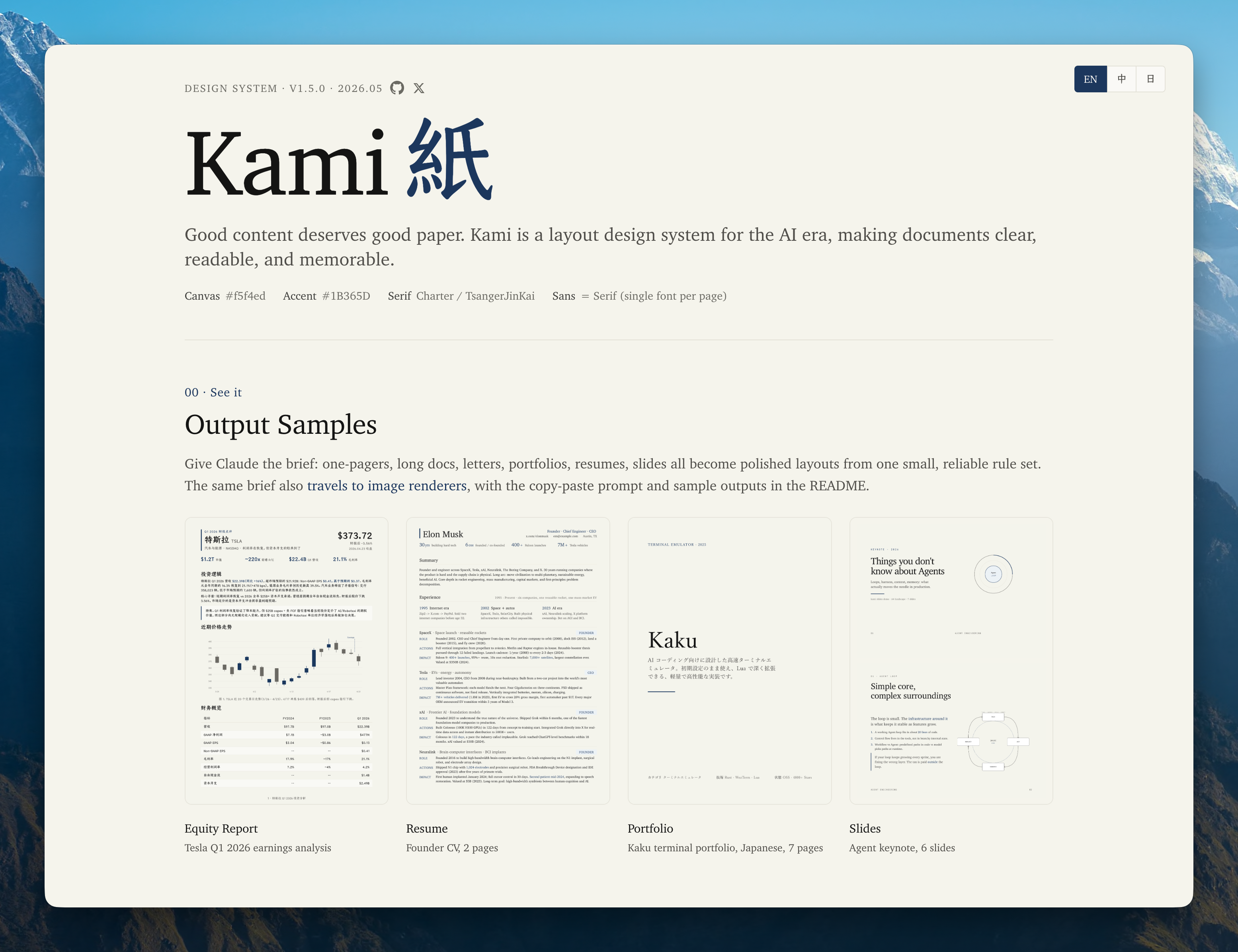
Kami
Good content deserves good paper.


Why
Kami (紙, かみ) means paper in Japanese: the surface where a finished idea lands. AI can produce documents better than most humans do manually. The missing piece is not capability but constraint: without a design system, every session drifts into generic gray and inconsistent layouts.
Kami fills that gap: one constraint language, nine templates, simple enough for agents to run reliably, strict enough that every output is something you actually want to ship.
Part of a trilogy: Kaku (書く) writes code, Waza (技) drills habits, Kami (紙) delivers documents.
See it
Nine real PDFs across templates and languages. Click any preview to open it.
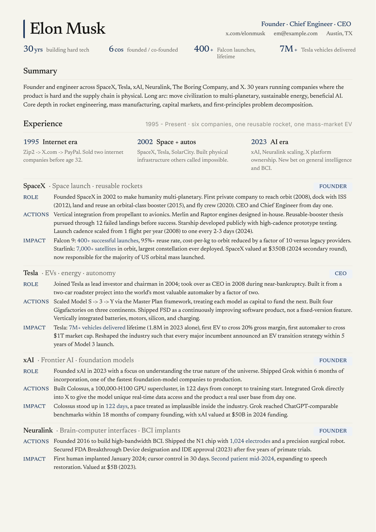
Resume · English Founder resume, 2 pages |
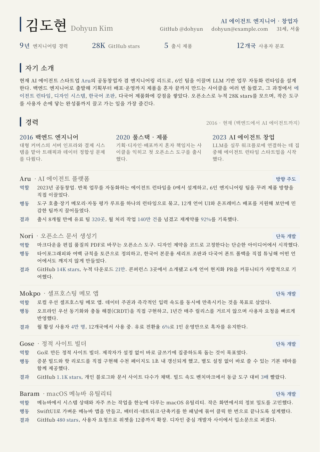
Resume · 한국어 개발자 이력서, 2페이지 |
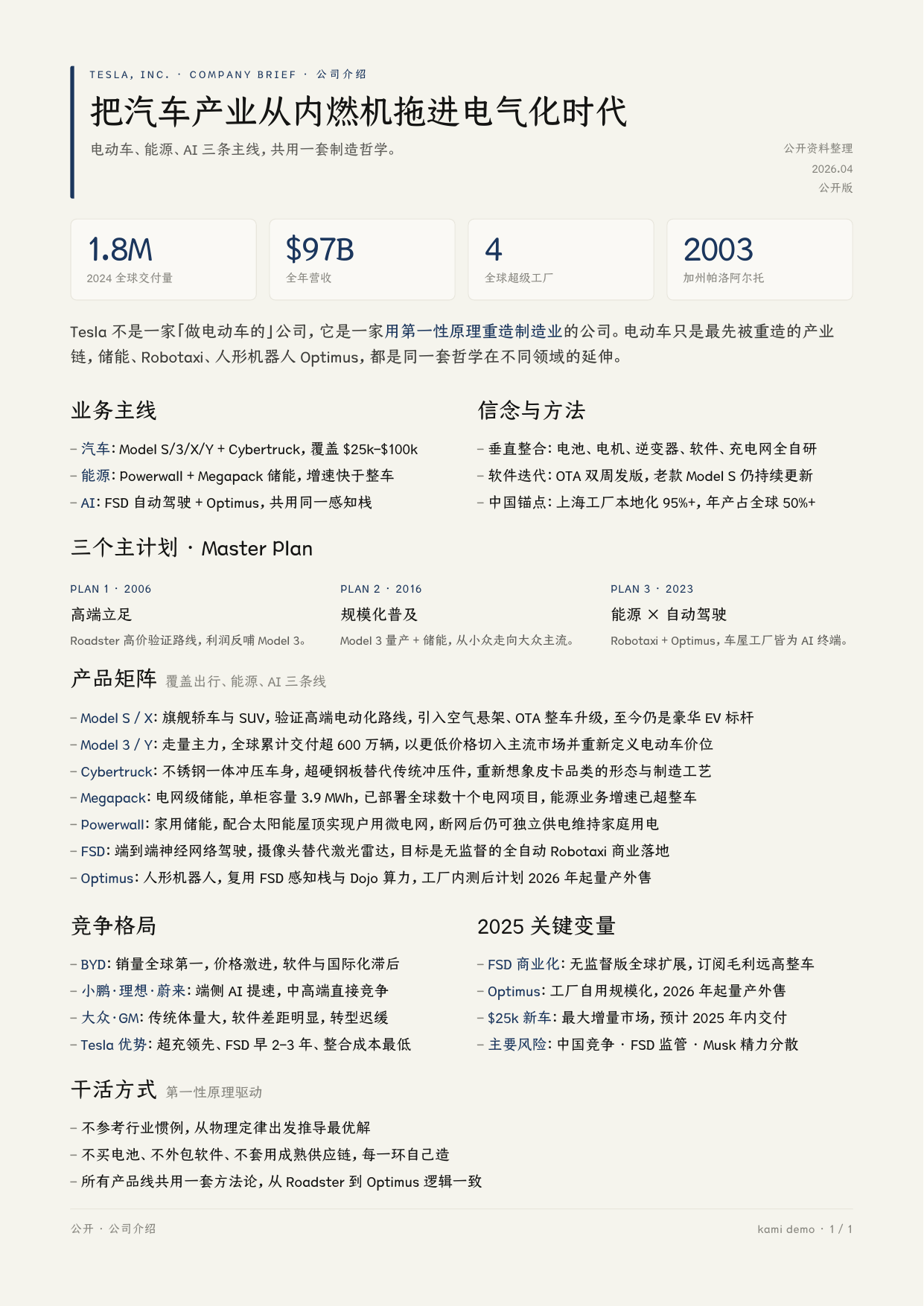
Equity Report · 中文 Tesla Q1 2026 财报点评 |
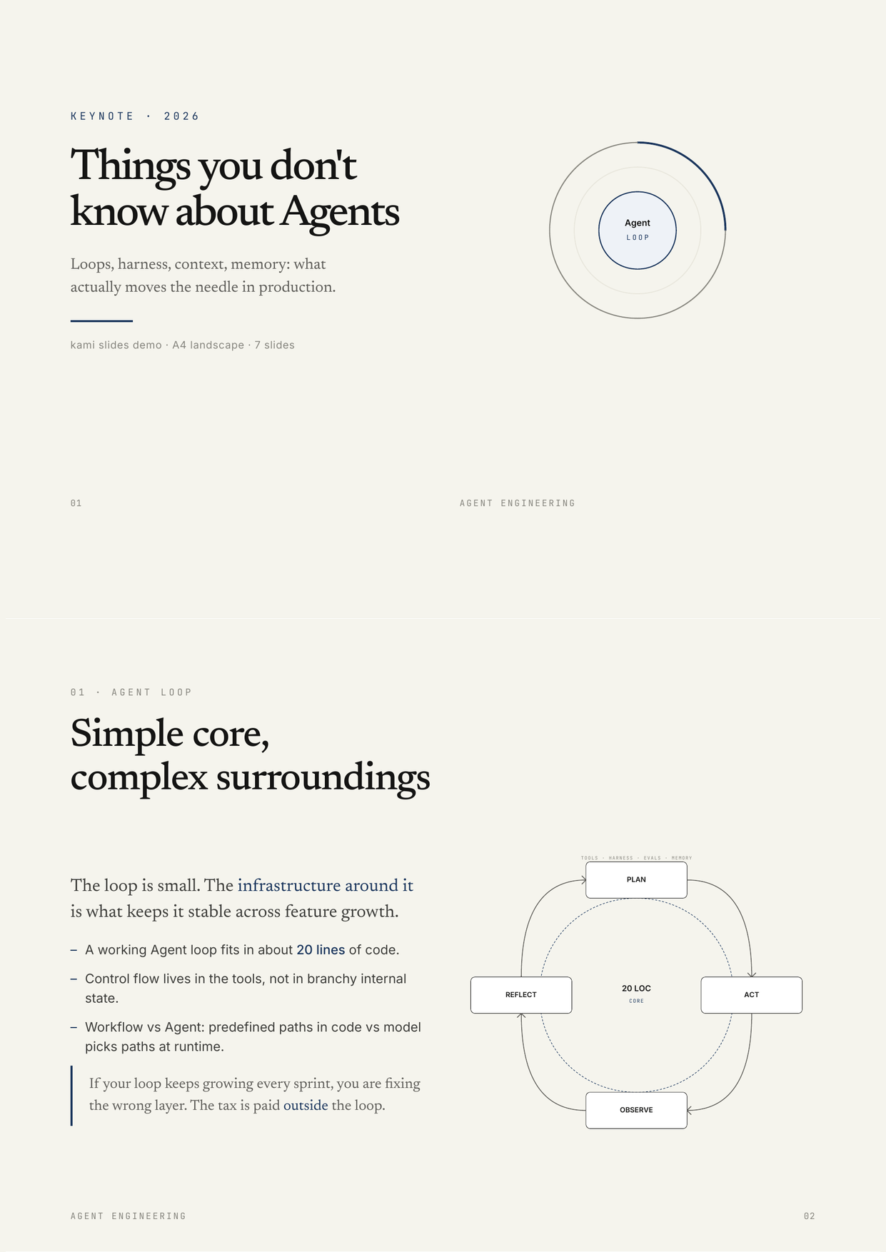
Slides · English Agent keynote, 6 slides |
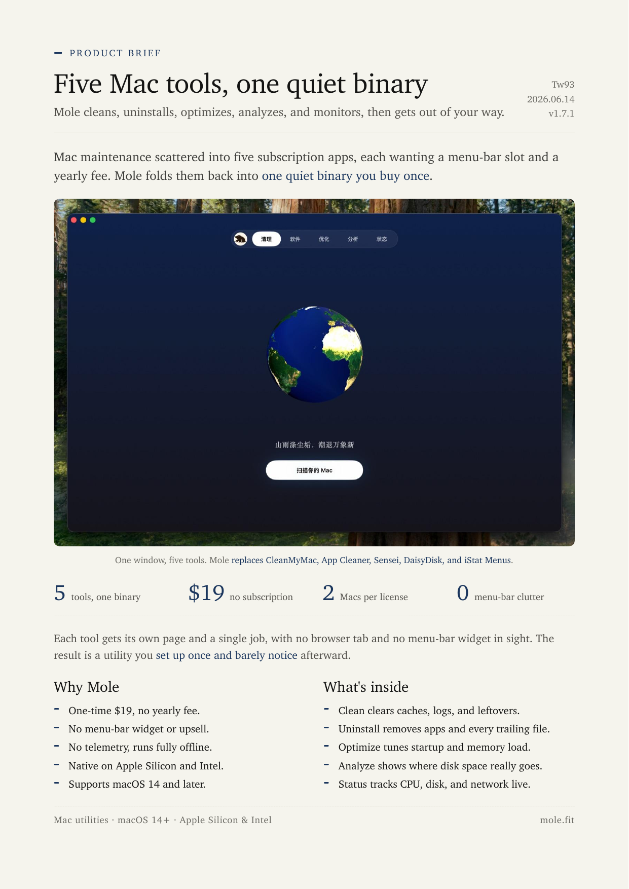
One-Pager · English Mole product brief, 1 page |
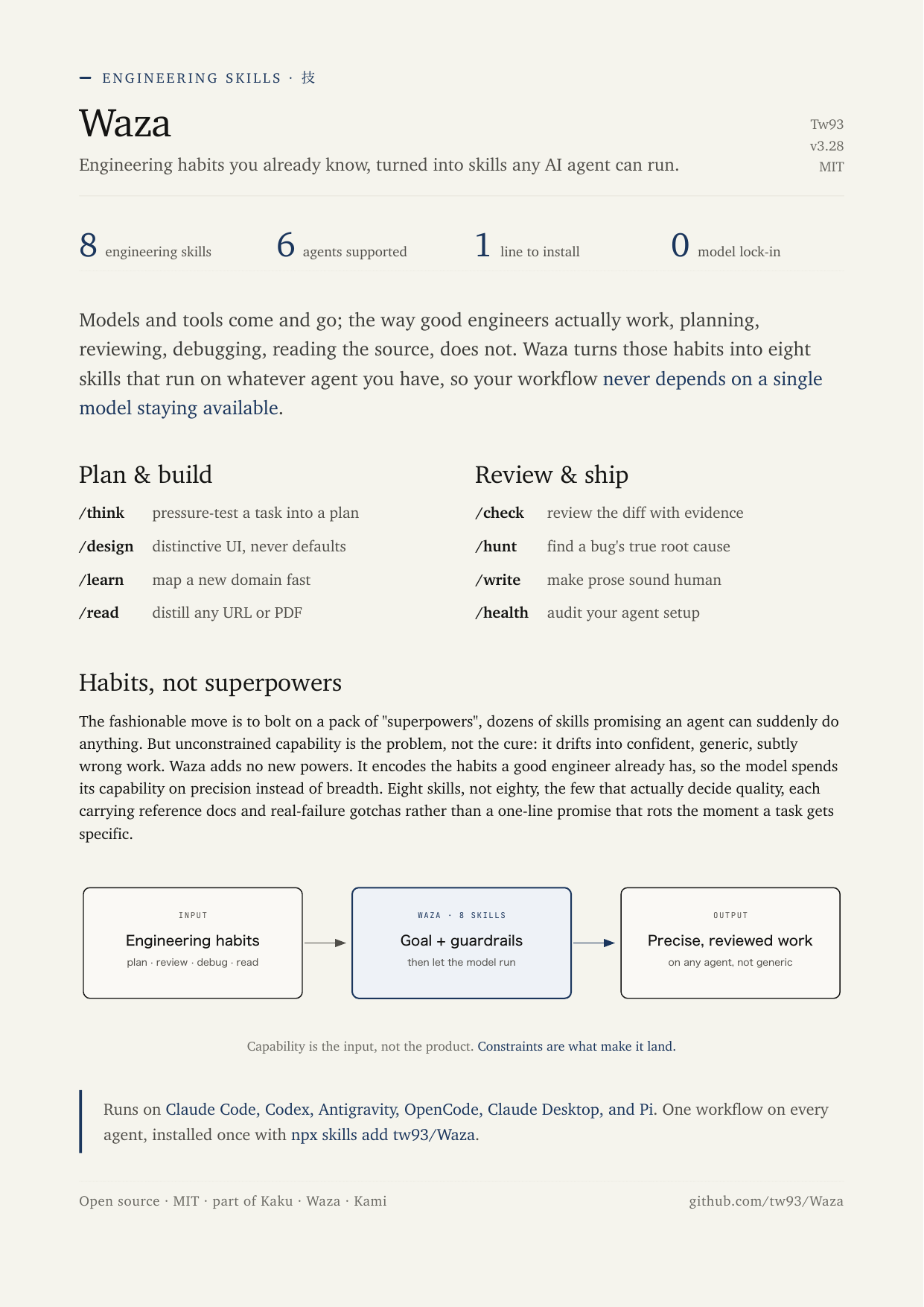
One-Pager · English Waza skills intro, 1 page |
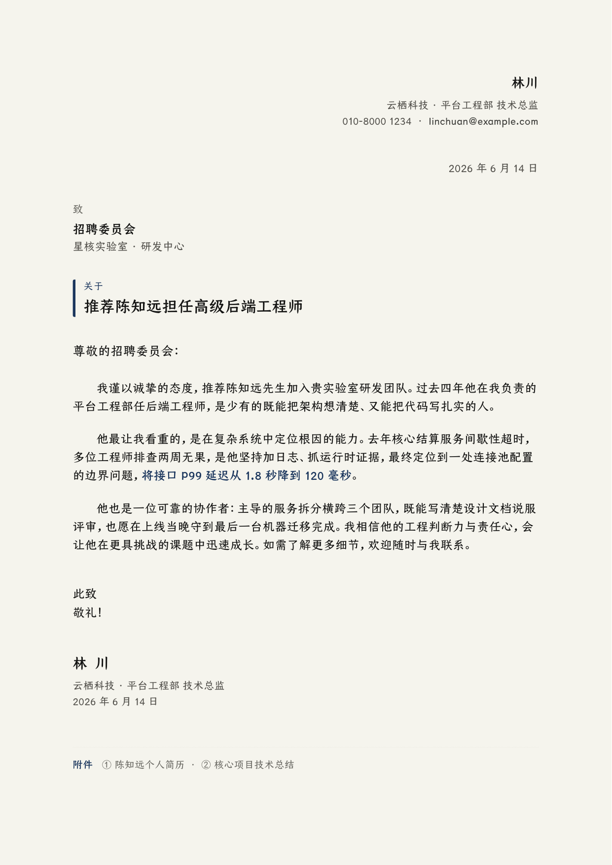
Letter · 中文 推荐信, 1 页 |
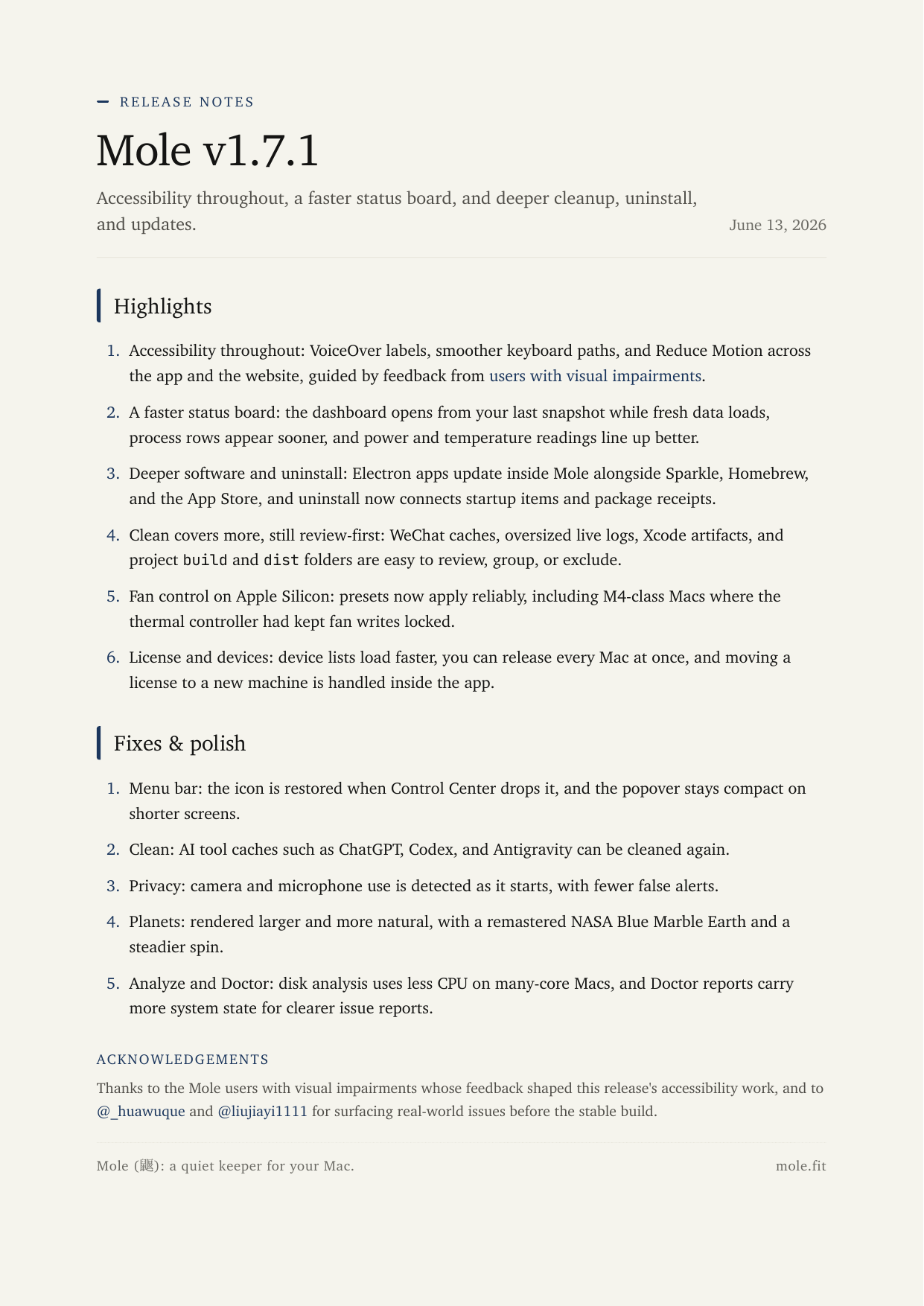
Changelog · English Mole v1.7.1 release notes |
Portfolio · 日本語 Kaku ターミナル作品集 · 7 ページ |
Landing Pages
The landing-page template in action: three products, one constraint set. Five .example companions (vercel, sitemap, robots, llms, llms-full) ship alongside for multilingual deployment.
Kami · English Design system homepage |
Luo · 中文 CJK reading font specimen |
Mole · English macOS system utility |
Usage
Claude Code
npx skills add tw93/kami -a claude-code -g -y
Claude Code plugin marketplace (requires Claude Code v2.1.142+)
/plugin marketplace add tw93/kami
/plugin install kami@kami
Codex plugin marketplace
codex plugin marketplace add tw93/kami
codex plugin add kami@kami
This installs Kami as a Codex plugin from the repo marketplace, so future updates can use codex plugin marketplace upgrade kami followed by codex plugin add kami@kami.
Generic agents (OpenCode, Pi, and other tools that read from ~/.agents/)
npx skills add tw93/kami -a '*' -g -y
Claude Desktop
Download kami.zip, open Customize > Skills > "+" > Create skill, and upload the ZIP directly (no need to unzip).
The ZIP is lightweight: large CJK fonts are excluded from the skill package. In a repo checkout they load from local font files first, then jsDelivr CDN; in an installed skill, scripts/ensure-fonts.sh recovers missing Chinese or Korean fonts into the user font directory.
Update
npx skills update kami -g -y
Claude Code marketplace installs use claude plugin update kami. Codex plugin installs use codex plugin marketplace upgrade kami, then codex plugin add kami@kami to refresh the installed plugin snapshot. Claude Desktop: download the latest kami.zip, click "..." on the skill card, choose Replace, upload. Kami also runs a quiet version check at most once a day and tells you in chat when a newer version is out; it only reads a public version file, sends no data, and is skipped when offline.
The skill auto-triggers from natural requests, no slash command needed. Optimized for English and Chinese; Japanese and Korean are supported via best-effort CJK paths with visual QA before delivery.
Example prompts by language:
- English:
make a one-pager for my startup/turn this research into a long doc/write a formal letter/make a portfolio of my projects/build me a resume/design a slide deck for my talk/make this talk as a Marp deck/build a landing page for my app - 中文:
帮我做一份一页纸/帮我排版一份长文档/帮我写一封正式信件/帮我做一份作品集/帮我做一份简历/帮我做一套演讲幻灯片/帮我做一份 Markdown 风格的演示稿/帮我做一个产品落地页 - 日本語:
スタートアップ向けの一枚資料を作って/この調査を長文レポートに整えて/正式な依頼文を作って/プロジェクト作品集を作って/履歴書を作って/登壇用スライドを作って/Marp で登壇スライドを作って/アプリのランディングページを作って - 한국어:
스타트업 원페이저를 만들어줘/이 리서치를 장문 문서로 정리해줘/정식 레터를 작성해줘/프로젝트 포트폴리오를 만들어줘/이력서를 만들어줘/발표용 슬라이드를 만들어줘/Marp 슬라이드로 만들어줘/앱 랜딩 페이지를 만들어줘
Optional: brand profile
Create ~/.config/kami/brand.md to persist identity, brand, defaults, and writing habits. See brand.example.md for a full template.
The file has YAML frontmatter (structured fields: name, role, email, website, GitHub, brand color, language, page size, currency locale, tone, and more) plus a Markdown body for freeform notes. Kami treats it as the lowest-resolution context: applied only when the current request is ambiguous, and always overridable by what the specific document needs. The goal is to feel familiar across your work without making every output look the same.
Design
Warm parchment canvas, ink blue as the sole accent, serif carries hierarchy, no hard shadows or flashy palettes. Not a UI framework; a constraint system for printed matter. Documents should read as composed pages, not dashboards.
Nine template types: One-Pager, Long Doc, Letter, Portfolio, Resume, Slides, Equity Report, Changelog, and Landing Page in EN, CN, and KO. Fourteen inline SVG diagram types included. Slides ship in three rendering paths: WeasyPrint HTML to PDF (default), python-pptx (editable PPTX, on request), and a Marp variant in assets/templates/marp/ for Markdown-first decks. Code blocks support Pygments-based syntax highlighting when Pygments is installed; without it, PDFs still render and code stays monochrome. Kami picks the right variant based on the language you write in.
| Element | Rule |
|---|---|
| Canvas | #f5f4ed parchment, never pure white |
| Accent | Ink blue #1B365D only, no second chromatic hue |
| Neutrals | All warm-toned (yellow-brown undertone), no cool blue-grays |
| Serif | Body 400, headings 500. Avoid synthetic bold |
| Line-height | Tight titles 1.1-1.3, dense body 1.4-1.45, reading body 1.5-1.55 |
| Shadows | Ring or whisper only, no hard drop shadows |
| Tags | Solid hex backgrounds only. rgba() triggers a WeasyPrint double-rectangle bug |
Fonts: Each language uses a single serif font for the entire page. Chinese: TsangerJinKai02. Japanese: YuMincho. Korean: Source Han Serif K. English: Charter. See License for font terms.
Full spec: design.md. Cheatsheet: CHEATSHEET.md.
Travel
The same constraint system doubles as a brief you can hand to any drawing tool. Point it at the references folder and the output inherits warm parchment, ink-blue restraint, single-line geometric icons, and editorial typography.
Apply the Kami design system from github.com/tw93/kami/tree/main/references
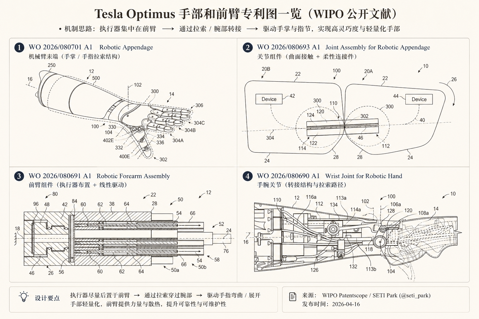
Evidence layout · 中文 Tesla Optimus 手部和前臂专利图一览 |
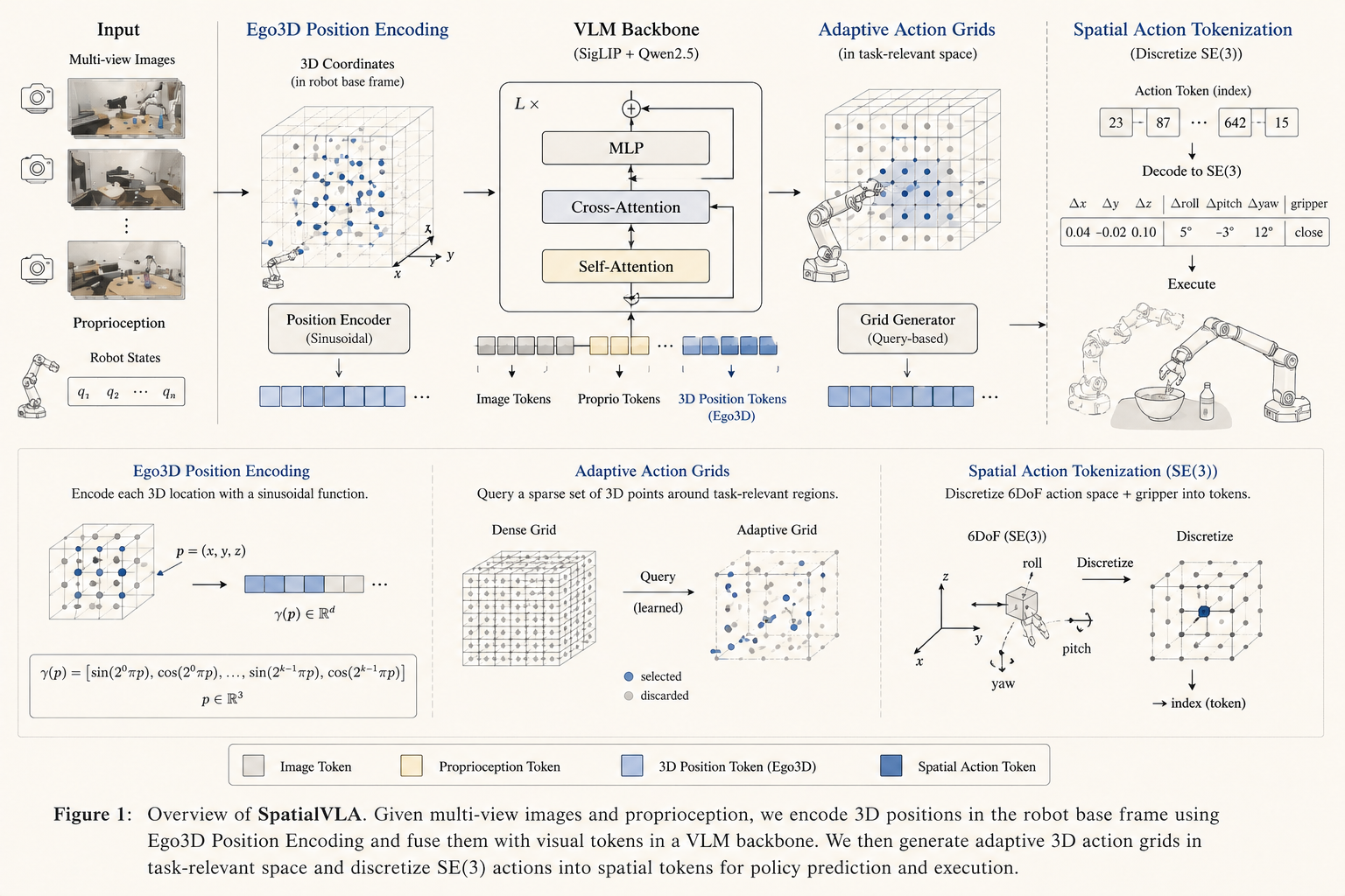
Architecture redraw · English SpatialVLA Figure 1, schematic |
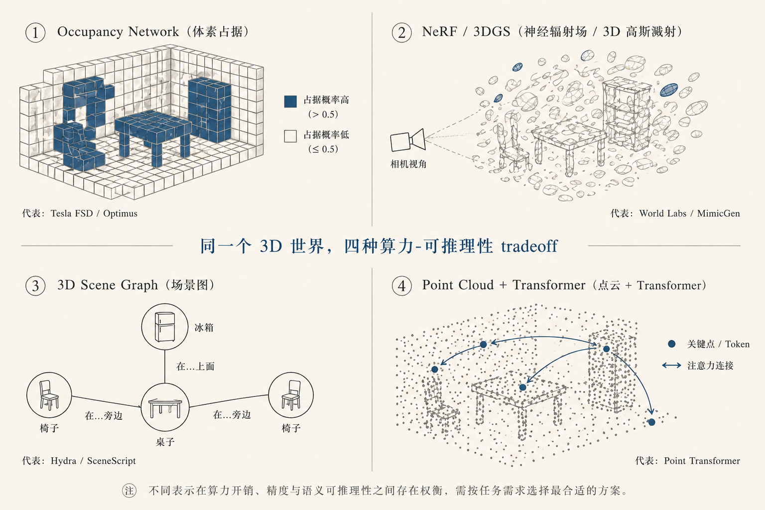
Concept tradeoff · 中文 3D 表示的算力-推理性取舍 |
Rendered by ChatGPT Images 2.0 in a single pass with no manual touch-up. Kami specifies, the renderer draws.
Background
I like investing in US equities and ask Claude to write research reports all the time. Every output landed in the same default-doc look: gray, flat, a different layout each session. The structure was hard to scan, the formatting felt dated, and nothing about the page made me want to keep reading. So I started fixing the typography, the palette, the spacing, one rule at a time, until the report became a page I actually enjoyed.
Later I needed to present "The Agent You Don't Know: Principles, Architecture and Engineering Practice." I already had the document and didn't want to build slides from scratch, so I used Claude Design to lay it out in my own style, tweaked it round after round, and eventually got it to a place I was happy with. That process added inline SVG charts, a unified warm palette, and a tighter editorial rhythm. It kept growing until it covered every document I regularly ship, so I kept abstracting the process, and it became kami: one quiet design system I can hand to any agent and trust the output.
Support
- The most direct way to support me is getting Mole for Mac, my paid Mac cleanup app.
- If kami helped you, share it with friends or give it a star.
- Got ideas or bugs? Open an issue or PR.
- I have two cats, TangYuan and Coke. If you think kami delights your life, you can feed them canned food 🥩.
These lovely people already did 🐱

License
MIT License for kami code and templates. Feel free to use and contribute.
Fonts: TsangerJinKai02 (Chinese) is free for personal use only; commercial use requires a license from tsanger.cn. Charter (English), YuMincho (Japanese), Source Han Serif K (Korean, OFL), and CJK fallbacks are system-bundled or open-licensed.